
Today for March Mapness I am featuring a few maps about destruction
First, a map I created recently charting the locations of all the known volcanoes that have erupted are in the world. Each location is colored by the number of known eruptions. The incredible "ring of fire" is visible around the pacific rim, with most volcanoes having erupted many times in the past. [original post]

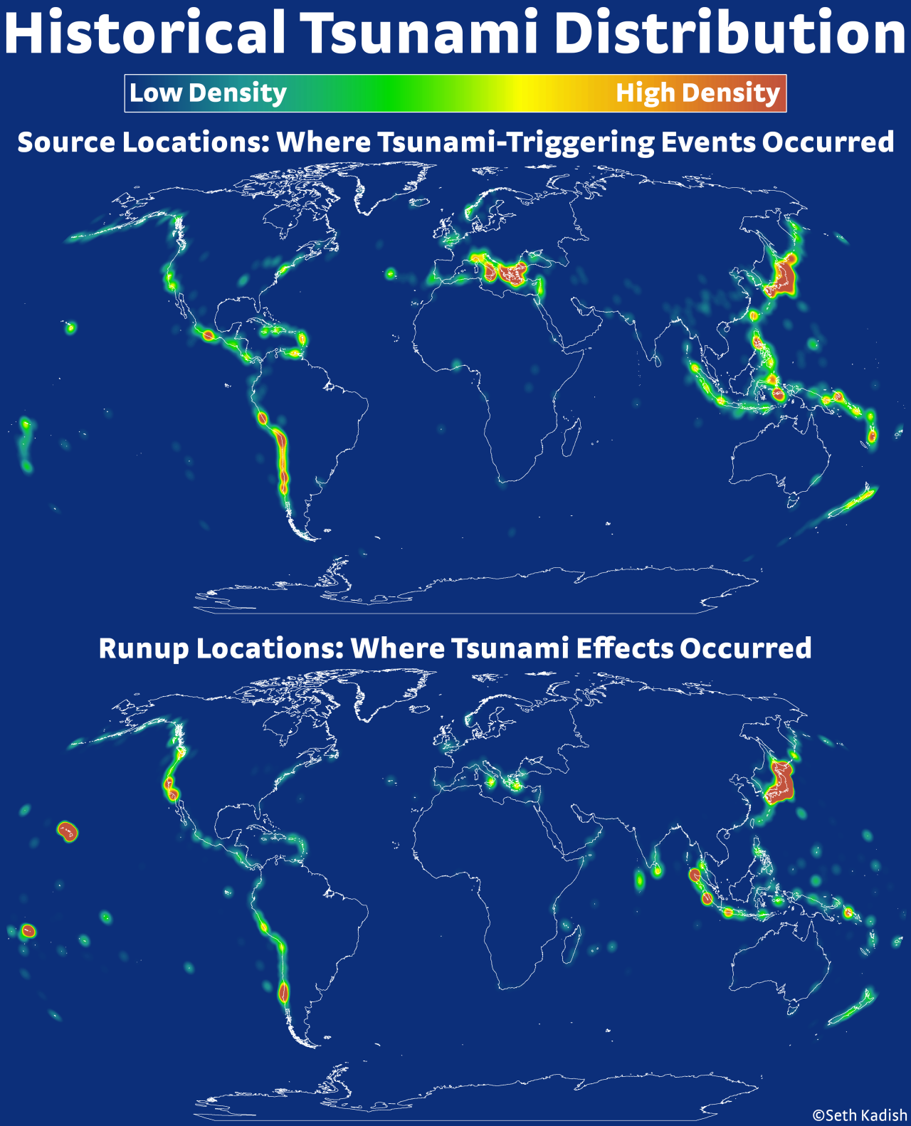
Next is a map from Seth at the always amazing Vizual-Statistix, showing the distribution tsunami triggers worldwide. [original post]. Interestingly, this map seems to resemble the one I made of volcanoes! There's probably a science for that...
Speaking of tsunamis, I have mention this incredibly powerful visualization from 2011 about the devastating earthquakes that rocked Japan. I've posted about this video before, as it is one of the most simple and compelling data visualizations I've ever seen.
Finally today, a map of the Black Death plague. There are countless excellent maps on this subject, and the history of disease and data visualization are closely linked. For example, the Broad Street Pump, or Florence Nightingale.


The earthquake visualization is crazy - but it's from 2011. I was holding my breath coming up to December 7th.. and then crickets!
ReplyDeleteAck you're right, it was 2011. Sorry, fixed that!
Delete