Showing posts with label statistics. Show all posts

Guest Post: High Stakes Dice

No comments:
Today I'm featuring another guest post from my good friend, Meredith. This short writeup (originally from her blog) demonstrates some basic statistics, and how they might apply to a very real world example. Given the misuse and misunderstanding of these basic stats in the media and current political discussions, and rampant junk science in my Facebook feed, I think this is a timely reminder.... take it away Meredith!
Unlikely things happen all the time.
Here’s an example. Let’s say you are rolling a 20-sided dice. You probably won’t roll a 20. I mean, you might, but you have a 1-in-20 chance, which is only 5%. This argument works for any number on the dice. Yet, you will roll some number between 1 and 20. No matter what you get, it was unlikely… but at the same time, you were bound to get an unlikely result. Weird, huh?
Now let’s say you have a very funny-looking dice with 100 sides on it. Each number only has a 1% chance of coming up. So, let’s raise the stakes a little. Each time you roll, getting 1–99 is just fine. Nothing happens. But, if you roll a 100, you have to pay $10,000.
So, don’t worry! 99% of the time you will be just fine. Just don’t roll the dice any more than you have to—it’s a pretty boring game without any apparent reward, anyway—and try not to worry too hard, because statistics is on your side. Right?

You’re curious, though. You wonder… how many times would you need to roll the dice for it to be more likely to get that 100, just once, than to avoid it completely? If you do the math1, you’ll find that 69 rolls puts you above the 50% mark. In other words, you are more likely than not to get a 100 if you roll 69 times.
Feeling lucky? Want to keep rolling? By the time you’ve rolled that strange 100-sided dice 700 times, you are more than 99.9% likely to get the dreaded 100.

Contraception fails much more often than 1% of the time.
Every time a woman has sex with a man, she rolls a dice. Depending on her contraceptive method of choice, or lack thereof, her dice has a different number of sides on it. But each roll always holds the possibility of pregnancy. Depending on her work, health, and insurance situations, she could be out a lot more than $10,000 in the coming year, not to mention having a child to raise.
Is your dice a condom? If you use them perfectly, that’s a 2% failure rate over one year. You only need to roll 35 times to be more likely than not to get pregnant2.
Is your dice a birth control pill? If you use them perfectly, that’s a 0.3% failure rate over one year. You need to roll 231 times to be more likely than not to get pregnant2.

This is the absolute best case scenario for these common contraceptive methods. It is why methods like implants and IUDs with extremely low failure rates of 0.05–0.2% are gaining popularity. It is also why emergency contraception exists—think of this as a second “bonus dice” you can roll if you get unlucky with the first one.
We can play this game all day. Women play this game their whole reproductive lives. You can’t take our dice away. You can’t tell us not to roll (well, you can try, but it does absolutely no good). But apparently some employers can deny us access to certain dice and virtually all bonus dice based on a “sincerely-held belief” in junk science.
And yes, women could ignore our employers’ preferences, save our hard-earned money, and go buy whichever dice we like. But this game has a different set of rules. Suddenly we have to be able to afford the dice we want. Suddenly it is not the same game other women can play for free.
Someday, I hope all women (and men!) can have free access to all manner of highly effective, side-effect-free, reversible birth control. I know that doesn’t seem very likely to happen any time soon. But then again, unlikely things happen all the time.

1 The math is actually pretty easy. I’ll use the notation P(something) to indicate the probability that something will happen.
P(not rolling 100) = 99/100 = 0.99
P(not rolling 100, with n rolls) = 0.99n
P(rolling 100, with n rolls) = 1 – P(not rolling 100, with n rolls) = 1 – 0.99n
For this last probability to be more likely than not, it needs to be greater than 50%. So when we solve this equation for n number of rolls:
1 – 0.99n = 0.5
We get n must be 69. In other words, if we roll 69 times, we’re more likely than not to get a 100.
If instead we want to be 99.9% sure of getting a 100, we write it like this:
1 – 0.99n = 0.999
Which tells us n must be 688 (nearly 700). If we roll 688+ times, we are 99.9% likely to roll at least one 100.
2 Statistics from this site. Note that per-year failure rates are not necessarily the same as per-roll failure rates. Contraception failure rates are typically calculated as “the difference between the number of pregnancies expected to occur if no method is used and the number expected to take place with that method,” so while this analysis may not be completely sound, the take-home message is unchanged: highly effective birth control is incredibly important.

We have always been at war

No comments:
This absurd title is of course taken from Nineteen Eighty-Four.

In the 2014 State of the Union address, President Obama reiterated his promise to bring our troops home from "America's longest war". 
"Longest war huh? That's a hell of a thing" my inner monologue replied.

Curiosity once again got the best of me, and I wondered: how long does war normally last? Let's find out! 

The Cost of Astrophysics

6 comments:

One of my favorite posts so far on If We Assume was "The Pace of NSF Funded Research", in which I showed that NSF-funded astronomy grants produce papers for up to 15 years! I made that figure while on an airplane with my friend Eric (who does cool stuff like this!) so that's fun too.

The data for that project came from the brilliant people at Harvard's CFA Library, who gathered every Astro paper published since 1995 that referenced a NSF AST grant. When they updated this database to include the budget amount for each grant, and were kind enough to notify me, I knew it was time to do a follow-up post!

The question that immediately jumped to my mind: 
How much does a typical Astronomy paper cost taxpayers?

Caveat Lector
I want to acknowledge this kind of analysis could be seen as inflammatory, insulting, or misleading. Please consider it in the lighthearted spirit it was intended.

1. A Typical AST Grant Costs $249k

Here I'm just showing a simple histogram (with log $ bins). Almost all grants are a few hundred-thousand dollars. The typical (median) is $249k, which for reference would pay for about 4 years of support for a graduate student at the UW, including overhead, tuition, salary, publication/page charges, 2 new computers, 4 domestic conferences, and a couple international conference trips.

2. Typical Grant size has started to drop recently

The orange line traces the median grant size each year. Our new tradition in America is to evidently not pass federal budgets. I'm not going to claim this is the cause of the drop in median grant allocation, but it's interesting that the last time a budget seems to have been passed in this country is 2009... My belief is that the NSF has tried to keep scientists from leaving the field, so giving out smaller grants means more people can still pay their rent.

3. A typical paper costs about $20k

According to some very simple (read: bad) math, take the # of papers produced divided by the budget of the grant and you get some kind of "cost per paper". This assumes that papers are the only real product of research, which is not entirely true. Conspicuously, this is about on par with a year's stipend for a graduate student (not including overhead and tuition, which about doubles that cost). I don't know if people will think this is too high or low (what is the going market price for a paper?) but the more I consider it the better a deal it seems! 

Here is an obtuse way of looking at this. Orange lines track the cost per paper versus grant size for fixed numbers of papers. Kind of silly

4. Paper costs are remarkably stable since 1995

There is a slight steady increase, but generally this is quite flat. The steep rise in the past 5 years is due to grants not yet reaching their full measure (see first post about grant productivity)

5. Small grants are more "efficient"

Maybe this goes without saying, and maybe this is the stupidest result of this entire analysis, but the best "bang for your buck" is in small grants... especially if they're reasonably productive! Naturally this kind of metric rewards people who cite every grant they've ever worked on in every paper, but is that a bad thing?

Below I show the "papers per dollar", literally inverting the metric from before (# of papers produced / grant amount). Once again we assume that papers are all that matters. In red I've highlighted the "most efficient grant", that which produced the most numbers of papers for the least number of dollars. (note this may be supplanted as newer grants continue to rack up papers)

By the power vested in me by the internet, I pronounce Detailed Modeling of Radiation Transport in Supernovae (1998) the most efficient AST grant since 1995, with 56 papers citing the grant and a meager $50267 awarded. Congratulations to Dr Peter Hauschildt.

6. Bigger $ grants don't necessarily yield more citations

If the number of papers is related to the "productivity" of a grant, the number of citations probes the "impact" of a grant. Interestingly, there does not appear to be much correlation between expensive grants and more "impactful" science. Take from that what you will.

I am also pleased to announce the winners for highest "impact per dollar" (literally # of citations for the grant / cost of grant). Below in blue I have marked the winner, Submillimeter Studies of the Cosmological Star Formation and AGN Histories (2000) with 3157 citations and only $37159! Well done, Dr Lennox Cowie. A slim $11.77 per citation! Notable runner up in this category is again Detailed Modeling of Radiation Transport in Supernovae (1998) in red, with 3571 citations.


Lastly: Citations versus Papers

I also realized that this database provided an interesting testbed to consider how papers gather citations. Generally this is a topic of great debate and interest, especially for young researchers. Below I've plotted the # of total citations a grant receives versus the total # of papers it produced. Of course this should show some correlation.

Also shown for reference is the "1:1 line" representing 1 citation for every paper (a baseline for impact?),  the "20:1 line" indicating 20 citations for every paper (reasonably good I'd say!), and something I've dubbed the "Line of Self-Citation". This curious line was calculated like so: if every subsequent paper you publish contains a citation for every previous paper you've published. I guess this would be better called the "Line of Cumulative Self-Citation". 
Obviously citation behavior never literally follows this Line of Self-Citation; imagine how horribly boring a paper with 100 different self-citations would be. Also - I'm not sure if this database has intentionally removed self-citations (sometimes done). What I find curious is that this Line of Self-Citation does a reasonable job of at least going through the data.

Finally: I'm not sure what to really make of this last figure, but I don't think I've ever seen anything quite like it. Have you? I'd love to hear your thoughts/feedback!

Stat Trek II - The Wrath of Cant

5 comments:
Recently the State of the Union speeches were (once again) scrutinized due to their low "reading levels". In an awesome looking figure, The Guardian succinctly demonstrated that the grade levels of these annual addresses were steadily declining over the past century. In simpler terms: the speeches appeared to be getting "dumber". This may be historically due in part to changing American dialects, as well as an evolving style of public speaking. Perhaps "reading level" tests don't always map well to spoken word, and they certainly don't capture the rhythmic or rhetorical value of oration.

cant (noun) | kant | - from Latin cantō: Jargon of a particular class or subgroup.

Last year I looked at the "readability score" for the Star Trek movie franchise. This basically entailed finding the closed-caption transcripts for all 11 films and sending them through an online Flesch-Kincaid Readability calculator. Such calculators use simple formulas based on the # of syllables per word and # of words per sentence to assign an approximate US grade level to the text. Basically, long sentences with big words equates to higher grade levels.

For part 2 in this series, I have examined the reading level for every episode of the Star Trek television franchise! Check it out...

1 Year of Blogging

No comments:
Today I felt rather proud: my blog turned one year old! The first post was mostly a placeholder, something to get the ball rolling. In it I posed the question: how long does the typical blog last? I still think this would be an interesting problem to gather data on... anyone have a good source of data?

So far If We Assume is a roaring success in my eyes. I've managed to publish about 4 posts per month on average, I've had some notable pickups/press, met some fascinating people, and I feel my blog traffic has been quite good!
A year of traffic on ifweassume.com
The blog itself has changed, grown, and shifted focus. I think it's fascinating to look back at my earlier posts, seeing what worked, what didn't. I definitely wonder: what will my blog look like in a year? What will I be writing about? I'd like to do some more astronomy related posts, and I thoroughly enjoy having guest posts on my blog.

Thanks to so many people for all the awesome conversations, ideas, support, and opportunities! I know Year 2 will be even more exciting!!!

Quantifying Happiness?

6 comments:
Over the holidays I spent a weekend vacationing in San Francisco with my lovely wife. We had a great time eating and drinking our way around the City by the Bay. I brought back a wonderful souvenir: a tin of excellent coffee beans from one of the many cafes I wandered in to that weekend.

I truly enjoyed the coffee, the simple presentation of the beans in the tin, and the memories of the great breakfast we had at their cafe. (Food/drink is always my favorite souvenir). I enjoyed it so much, I made this silly "graph" charting my happiness as I opened and sampled the coffee a few days before Xmas.
This raised a question in my mind that I invite you, dear reader, to comment on!
Can we really quantify happiness?

In other words, could we actually measure the enjoyment of something as simple as a cup of coffee in real time?


I know research has been done on quantifying pain, and the state of happiness does release lots of unique chemicals into the brain. But happiness is a complex and often subtle emotion. In what way does elation differ from stoic satisfaction?

Of course, I'm not the only one considering such questions. Given how important happiness (and its many variants) is to quality of life, health, stress, and consumerism, I'd imagine it's an important area of research.

It is also a topic of frequent pseudo-charts, like mine above. Here are a few from PhD comics to amuse: Work output vs time, Vacation vs stress, Motivation level vs time. My first officemate in gradschool also once drew "Happiness vs Time in Gradschool". It was an illuminating, albeit somewhat depressing, visualization.

I invite your thoughts, links to relevant literature, or links to other good pseudo-charts on the subject in the comments below! 

Talk With Your Hands

No comments:
In the last few years TED conferences have come to represent the top rung for "intellectual rock stars." What began as a small annual talk series in the early 1990's, has ballooned into an international sensation since they began providing videos online in 2006. It's a remarkable powerhouse that has made data experts like Hans Rosling a household name. TED now comes with legions of fans, people willing to pay several thousand dollars for the privilege of sitting in the audience, a fellowship program (a shining example), and even a "play along in your hometown" version called TEDx.

TED is not without critics, as with all successful endeavors. The founder of TED is no longer involved, and is trying to "reinvent conferences again". Here's an interesting review of the growing  "intellectual populism" that TED is contributing to; not necessarily a bad thing, but it's interesting.


One thing that I have taken away from watching a fair number of TED talks since 2006, as well as watching the late Steve Jobs speak, is the value in being a seriously good public speaker. There's a lot involved in making a great talk, from slide design and composition (a recent post I wrote on the importance of contrast in slides for Visually), to speaking tone, pace, inflection, and body language.

Recently I noticed something about the thumbnails shown for TED videos: the frame chosen from the talk seemed to usually feature people gesturing with both hands.

Gesturing with your hands is very normal when you talk, especially when you're giving a lecture or speech. Funny or unusual hand motions when talking can become iconic (I've always loved Dana Carvey's George Bush Sr. impression for this). Good hand motions can even help you convey your authority or confidence when talking, which is absolutely an asset.

I wondered, looking at a few dozen of these thumbnails, how many hands do people typically gesture with in TED talk thumbnails?

So, consumate scientist that I am, I gathered some data!

Washing Pants, by the Numbers

1 comment:
Be sure to subscribe for updates to If We Assume! 

Last week I asked a simple 3 question survey about washing frequency of pants... specifically: in your opinion how long can pants be worn before needing washing? This is a question I thought up a while back when reading about a kid who wore his jeans for 15 months (crazy!). So finally I did the responsible thing and gathered data! You know, for science...

I wanted to keep the survey short and sweet, and submitted it to about a half dozen subreddits, my facebook, and my twitter feeds. I'm sure there's all manner of other variables that would have been interested to study this against (e.g. jeans versus slacks, as many pointed out), but I felt keeping it short would provide an easier survey and yield a higher response rate.  Here is a screen shot of the survey:

Race in US Colleges

2 comments:
Be sure to subscribe for updates on this and all my other data analysis projects! 

The Chronicle posted a nice spreadsheet containing race, ethnicity, and gender data from ~4300 institutions of higher education across America. (Note: the article and data file are now behind a paywall, which was not in effect when I downloaded the data set)

It's a really intriguing data set, and I thought it was worth a few minutes of my time to play with it. My results are amusing, but I don't think I've fully captured the rich potential this data has to offer serious researchers.

My first question was simple: what does the most basic racial composition of US Colleges look like?

NFL Replacement Referee Bias

1 comment:
Today I'm happy to feature the first guest post on If We Assume, written by fellow astronomer Peter Yoachim! He's discussing the now-famous debacle by the replacement referees (see also here) that occurred in last night's Seattle Seahawks game (Some are calling it the "worst call in NFL history"). Take it away Peter...

Getty Images

After watching the refs botch Monday Night Football (Go Seahawks!?), I was wondering if there's a way to quantify just how bad the NFL replacement referees are.

One thing that stood out in the game was how many calls went the Seahawks' way on the final drive--which reminded me of the discussion of home-field advantage in Scorcasting.  They concluded that referee bias is the primary driver in home-field advantage across sports.  They even note that in the NFL from 1985-1998, the home team won 58.5% of the time, but after instant replay was introduced, the home team only won 56% of the games (1999-2008).

If the replacement refs are much worse than the regulars, we might expect the home-field advantage to grow.  My logic being, if the refs are botching more calls, those botched calls will tend to be in favor of the home team, that gives them an advantage, so they should win more.

How have home teams fared so far?  After 48 games this NFL season, the home teams have a record of 31 wins and 17 losses, for a whopping 64.6% win rate!  But is that significantly more than 56%?  31 wins is actually only 4 more wins than we would have expected with the regular refs.  As always happens when I try to calculate the statistical significance of something, I got bogged down in an arcane wikipedia page, when it told me to look up some value from a table.  Whenever a statistician tells me to look something up in a table, I reply, "Fuck that, I can Monte Carlo this in 5 lines of Python."  So I did:


#play 10,000 seasons of football with 48 games each
hg = np.random.rand(10000,48) 
#home team wins 56% of the time
hg[np.where(hg <= 0.56)]=1 
#the rest are losses
hg[np.where(hg < 1)]=0 
#total up the wins per season
ack = np.sum(hg, axis=1) 
print 'probability of home team winning 31 or more games with 1999-2008 refs = %.2f'%(np.size(np.where(ack >= 31)) /10000.*100)+'%' 


If you run that, you find out that we would expect  31 (or more) home team wins only 15% of the time.  To turn it around: 85% of the time the home teams have fewer wins at this point in the season.  We normally say something is significant when we reach the 5% level, so we're not there yet.  If the home teams keep winning at a 65% rate (or higher) for 3-4 more weeks we should make it to significance!  That's about the only reason I've found to root for the replacement refs sticking around--damned, scabs!

NCAA Football Coach Salary vs. Wins

3 comments:
Be sure to subscribe for updates on this and all my other data analysis projects! 

A question was posed to me the other day: "Is Steve Sarkisian (head coach for UW's football team) worth the money we're paying him?". For the record, his salary is currently around $2.25 million, though he's not paid by tax payer money.

The question of an employee's worth intrigues me. No doubt people have strong opinions/feelings on the matter. How do we quantify this to answer it objectively?

In the case of a factory worker, we might say that the number of gizmos he/she produces per hour without error determines their value. I don't think this kind of metric works for things like teachers...

Still, football coaches are often judged based on their team's performance. So I decided that the best way to answer the question was to compare the salaries and win/loss records for NCAA FBS (aka Division I-A) coaches.

Detailed data on coach salaries wasn't super easy to find, I would have liked to find a neat & tidy table with salary broken down by year for each coach, alas. I did find this nice compilation by USA Today. I grabbed win/loss stats here. Note: for my analysis I have not followed up on any of these stats/teams individually, so no doubt there have been hires/fires and raises/cuts which will affect the specific details.


The correlation between higher pay and better winning percentage is promising. The median salary is $1.46 million. Texas is doing well, but boy they're paying for it! I then subtracted a linear fit (dashed line) from the winning percentages to determine the typical scatter.


The standard deviation in winning percentage at a given salary is +/- 12%. All the coaches that fall within this "region of acceptable performance" are highlighted in purple. I believe these coaches are "worth it". Twice the standard deviation is gold/yellow. Coaches in this region should either be asking for a raise, or watching for the hammer to fall.

There are a few major outliers that bear mention. Boise State is getting a whopper of a deal (as noted in Fig 1), as well as Ohio State. On the unfortunate side, Duke is very far below par; the sole outcast in the negative 3rd standard deviation. This doesn't bode well for an athletics program under scrutiny to dial back costs.

So this has all been in good fun, and I certainly hope no one is actually fired on my account! Looking at Washington in particular, Sark seems to be just below the standard deviation, but in fairness he's only been coach since 2009. After our victory over Portland State this weekend, I'm hopeful he'll make up some lost ground this year!

The full table of data is below the fold...
Update: due to demand from the wise folks on Reddit, I have updated the table to be sorted by School name and added helmet thumbnails. (I took them down, it seemed to be causing havoc with his website)

Astronomy Programming

1 comment:
Today I'm attending a workshop on "astroinfomatics" at Microsoft Research, and one question that has come up all morning is: how much computer science do we need to teach astronomy students?


Here is my summary slide on the problem
Clearly there is need for people at all levels of expertise, but how much do you need to know to actually do research? What do you think?

The Pace of NSF Funded Research

8 comments:
Recently on Facebook I came across a note by Chris Erdmann that some handy folks at Harvard put together statistics on (nearly) every astronomy paper from 1995 to present that was funded through an NSF AST grant. This seemed like a really interesting dataset, especially for a young (read: financially uncertain) research such as myself.
So parsing through all 29,042 papers listed, here are two interesting things I've learned...


1. A typical AST grant produces < 10 papers

This is a simple histogram of the number of papers each unique Grant Number produced. Many people have only produced 1 paper with a grant, but the average is about 8.75 (and the median is 3).
Distribution of number of papers per grant, with a
mean of 8.75 papers per grant (blue dashed line)


2. A grant has its peak output of papers at 3.1 years 

This is a more intriguing figure to me. I've plotted (Year Published - Year Grant Awarded) as a function of Year Grant Awarded for all 29K papers, and then binned it up with pixels. You can clearly see the peak productivity between 2-4 years. I've marked the mean (solid orange) and stdddev (dashed orange) lines for each year.


"nsfastgrantbib" data from the Astronomy Dataverse

Conclusion

Following this second figure, we expect that the grants from 2009 onward have only produced maybe half of their useful (publishable) results, despite many with dwindling funding.

Likewise, it's very encouraging that the grants awarded today will still be producing usable science well into the next decade!

Finally, we are reassured that Astronomy is an exciting and fast-paced field, and that continued strong funding is required to preserve this fact.


Data Reference
Christopher Erdmann; Louise Rubin, "Compiled List of NSF Grants to ADS Records from 1995 to August 2012", hdl:10904/10152 V2 [Version]

Increasing Blog Traffic

1 comment:
Be sure to subscribe for updates to If We Assume


This year I decided to launch my personal blog, and it's been more fun than I ever imagined! Blogging is attractive in similar ways as publishing: people reading and discussing your work. Bonus: Writing about data and science provides me with a great subject matter, and lots of fun graphics. I have lots of cool ideas in the pipe, mostly waiting for free time (in short supply during grad school) to write them.

There is a glut of information online about how to build your blog traffic and increase readership. Some of this I've actively worked on, some seems like obsessive nonsense. A lot of it is spam. Here are seven of the lessons I've learned about building a blog. This is largely an empirical study of blogs, including my own, and meant in good fun...


1. Spend time worrying about the design of your blog/website. The default (e.g.) Blogger themes are nice, but they need to be fine tuned. There are lots of little tweaks that are easy to make, and make a huge difference (I think) in the aesthetic. 

2. Stop worrying about the design of your blog and write. If your website looks like a Dieter Rams masters class, but only has 3 posts, then you'd better keep your day job. For me, the joy in blogging is writing and discussing ideas with people, not worrying about button placement.

3. Let other people do your work for you. Lots of people re-post material, some advocate for outsourcing or splitting your writing workload. I like to get post ideas from my friends/family. I also use Blogger (currently) to host/drive my blog, as it takes all the work out of backend and lets me focus on the parts I enjoy! I don't want to be a web developer

4. Post often. Duh. Otherwise traffic dies off... fast.

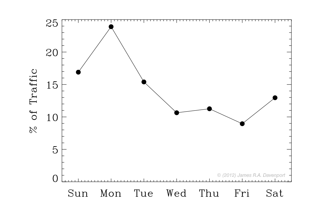
5. Post before Mondays. As this figure shows, the analytics on my blog indicate that Mondays have the highest traffic. This may differ based on where you get readers from, and of course your type of content. I've seen it written that Thursday is the best day to post, in time for the weekend e-traffic. I think this matches my results.


6. Prey on people's insecurities. Again and again I find that one of the best ways to gain blog traffic is to write about gaining blog traffic. If you've ever watched television you know that diet pills and enhancement drugs are big business. It seems sensible, therefore, that if you want to easily get large traffic, write about how people can solve their problems without significant effort.

7. Participate/advertise in social media. I like Reddit and Twitter, but haven't had much luck with stumbleupon yet. YMMV of course. These kinds of outlets provide impulsive blog traffic, and converting this to moderately increased long-term readership is the goal. The figure below shows the impulsive response my site has experienced from (mostly) Reddit, with an increasing baseline of traffic.
 

Curiosity has Landed

No comments:
NASA - Curiosity's Heat Shield in View
Doug, the really nice barista at my favorite coffee shop, was chatting me up today about the Mars Science Laboratory (MSL), better known as Curiosity. We agreed that the entire landing affair was stunning, and the photos being sent back are nothing short of inspirational. I particularly liked the photo from Mars Reconnaissance Orbiter of the parachute deployed on Curiosity.

The interaction got me thinking about the social impact of big news events in science. One curious aspect of the MSL landing (to me at least) has been the online and social networking presence, which I've not really seen in a NASA mission before to this extent. Sure, more traditional media played a large part in the popularity of this landing, but Twitter seemed to be the place du jour to spectate. In fact, Curiosity has its own official Twitter feed, and a less official but perhaps more insightful one as well.

Engineers, NASA interns, space buffs, news outlets... everyone seemed to be Tweeting about this plucky robot. Now, people like me are discussing the discussion (so meta), hoping that it signifies a new era of public outreach/interaction, and driving more suckers inspired youths to study science.

So I thought it would be cool to look back at the trend of Tweets mentioning the landing, using the simple analytics tool from Topsy Labs. Ignoring the bizarre horizontal axis tick spacing, it's fascinating to see the "shape" the event takes: a strong ramp up for a couple days before the landing (Aug 5, if that's not blazingly clear), a sharp declining interest the day after, and a long tail, the latter no doubt filled with pithy humor.
Chart from Topsy Labs. 
Mars is so cool... bydhttmwfi

Stat Trek

No comments:
USS Enterprise (refit) - from Wikipedia
It's a well known fact that I'm a big Star Trek fan, having spent way too many hours in childhood (and college) watching every episode and movie. Between Trek and my enjoyment of statistics/visualization, I guess you could call me a Data Nerd... oh man, I kill me.

Thus, it's only natural I should combine these passions, and bring to you STAT TREK

Racial Perceptions - A First Glance

4 comments:
Be sure to subscribe for updates on this and all my other data analysis projects! 

Last night I had a few hours to kill at a cafe. The cafe had decent coffee, and slow wifi, so I thought it would be a good chance to mess around with the preliminary results from my race perceptions survey! I am intending to dress this up quite a bit when I get more respondents (the survey will remain open for now).

For now, here is a first "quick and dirty" look at how our perceptions of racial composition track with reality.


Map of Respondents

Here is the updated map, with ~380 people responding across the country. There is major clustering around certain major cities, owing to my sending the survey to my Facebook friends (largely in WA), and two region-specific subreddits (r/seattle and r/sanfrancisco). The sample of respondents is ~80% white, 55% male, and 90% are within the 18-25 or 25-35 age groups.

In red: density of zip codes across the US. Survey respondents are marked in blue.

A Short Survey

No comments:
Hey, would you like to help me out some? I'm conducting a survey about our perceptions of race in America, and how they relate to the "real data" (the 2010 US Census). It's short, only takes about 60 seconds!

While this isn't Astronomy related, I think it fits nicely in my overall curiosity about the world (academic creativity, one of my mentors recently called it). The primary question I'm trying to answer is simple: Do people have an accurate understanding about the racial composition around them?


This was borne out of hearing a lot of people say (e.g. in Seattle) "gosh there are so many asians in Seattle"... or similar such pig-headed declarations.

The racial composition of a city is fascinating on its own: here's some quick data on Seattle, for example, and an awesome map. Whatever your feelings/standing on race in America is, you can't deny it's a fascinating and rich field of study!

But I'm really interested in using data to do more than just "butterfly collecting", but rather to understand how we think about ourselves and each other. It's all very meta and philosophical, and plays in to my notions about science and the/my future in astronomy, and I'd love to tell you more about it!

So check my website in the near future for updates on this project, or follow me via email/rss/twitter/facebook/etc. In the mean time: TAKE MY SURVEY!

Thanks!

North Dakota and Maine: Where's the Love?!

2 comments:
Image generated by Google Analytics

As of thursday this blog has passed 10,000 page loads, and I'm super excited that people seem to be reading it! My friend Alex said that I'm a "huge data nerd", a great compliment I'd say, and I hope my blog reflects this. Like any data nerd who runs a blog I have many analytic tools that track visitors, page loads, visit duration, etc.

Flipping through the report on Google Analytics, I was excited to see I had received visitors from every State in the Union... except two! I understand that WA has +99% of the page loads, since I've promoted my content in places like r/seattle and on Facebook. But what gives with ND and ME?? Apparently my content is least interesting to them...

To be fair, I've never been to either state. So I'm taking this opportunity to learn a bit about them! As Cliff Clavin might say "here's a little known fact...". Did you know...

ZIP Code Density

No comments:
Color/darkness represents the number of ZIP codes within each pixel.

I've been playing with some neat data from the 2010 Census, and in honor of Memorial Day I thought this was a super fun plot to show. The actual post that I'm working on related to this will probably take a long time to complete, as it requires I gather a ton of data...

 I'm using the "CubeHelix" color scheme (shameless promotion: I wrote the first version for IDL). This scheme is great because it de-saturates from color to black/white while correctly preserving brightness. It can be rainbow colors too, not just monotone like above.

For example, here is the same figure, but with the color turned off (using Apple's Preview app). Great for making figures that look good both online (where color printing is free) and in black/white print (e.g. ApJ charges $350 per color figure, last I checked)